The Great Travel Blend-In
105 independent travel homepages, deconstructed and compared, to show you where operators blend in and how to build a homepage that gives travellers a stronger reason to choose you.


105 independent travel homepages, deconstructed and compared, to show you where operators blend in and how to build a homepage that gives travellers a stronger reason to choose you.



Pick almost any part of the travel market and you’ll find no shortage of businesses competing for the same traveller.
Search for a safari in Botswana, a boutique hotel in Mallorca or something to do on a weekend in the Lake District and you’ll quickly have plenty of credible options to choose from.
Which means that at some point, every operator has to answer the same question: why choose us?
Your homepage, where much of the attention you work so hard to earn ultimately ends up, has to make that case.
But after seven years working in travel and spending a lot of that time looking at travel websites, we’ve seen the same patterns come up again and again.
The destinations change. The businesses change. The type of travel changes. Yet many of the homepages feel strangely familiar.
The same kinds of messages. The same ways of establishing trust. The sameways of presenting trips and experiences. Even many of the pages themselves seem to follow a familiar formula.
We knew the patterns were there. What we didn’t know was how widespread they were, or what would happen if we put enough travel homepages side by side and compared them properly.
So we decided to put 105 travel homepages under the microscope.
So, what we did is we went ahead and analysed 105 independent travelhomepages across three parts of the industry:
Tour operators, accommodation providers and experience providers.
We weren’t interested in ranking them, picking winners or deciding which ones looked best. We wanted to understand what happens when you stop looking at travel websites individually and start comparing the choices they make collectively.
For each homepage, we looked at:
We focused specifically on the homepage rather than analysing the entire website. A business may have great content, tools, expertise or proof elsewhere. What interested us was what each operator chose to put in front of the traveller on the page where much of the attention they work to earn ultimately ends up.
And once all 105 were sitting side by side, the patterns became much easier to see.
58% of the 105 homepages led primarily with the destination, trip orexperience being sold. And when we looked at the homepage as a whole, 59% were predominantly focused on selling the product rather than the operator behind it.
That isn’t necessarily a problem. If someone lands on a safari operator’s website, they need to see the safari. A hotel needs to sell the stay. An experience provider needs to make the experience worth doing.
But there is a difference between making someone want what you sell and making them want to buy it from you.
A homepage full of extraordinary wildlife can make Botswana desirable. Beautiful rooms can make someone want the hotel stay. A great image of people kayaking along the coast can make the experience look worth doing.
The harder job is giving the traveller a reason to choose this safari operator, this hotel or this experience provider whencredible alternatives are only another tab away.
Across our sample, that balance often tipped heavily towards the first job.
The travel was being sold. The reason to choose the business selling it was often much harder to find.
If the product alone isn’t enough to differentiate an operator, the obvious next step is to explain what makes the business different.
And almost every homepage tried to do exactly that.
The problem was how often those differences were expressed using the same language.
Across the 105 homepages, some of the most common differentiators were:
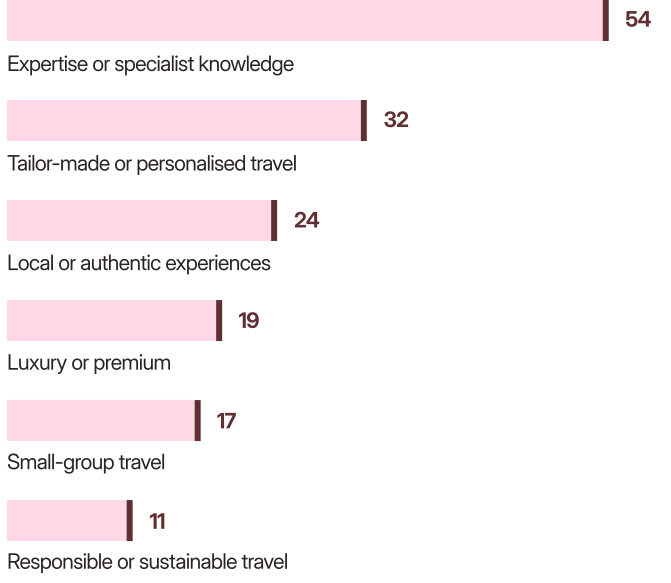
There is nothing inherently weak about any of these propositions. Expertise matters. Personal service matters. Local knowledge can materially change a trip.
But the more frequently a claim appears across a category, the less work the words alone can do to distinguish one business from another.
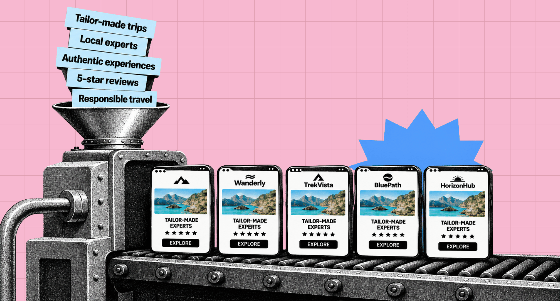
Take expertise. More than half of the businesses we analysed used expertise or specialist knowledge as part of their differentiation. So telling atraveller that you are an expert may be true, but when dozens of credible competitors are saying the same thing, the claim itself gives them very little to choose between.
The same applies to tailor-made, authentic, local and luxury. The issue isn’t whether the claim is true. It’s whether the traveller can see what that claim means here, and why your version of it is different from everybody else’s.
That takes us beyond what operators say and into something much more useful: what they actually show.
Once a differentiator becomes common, the burden shifts from saying it to proving it.
So we looked at whether the homepages actually demonstrated the qualities they claimed made the business different.
Only 19% of the 105 homepages were predominantly showing rather than telling. 38% relied mostly on claims, while the remaining 43% sat somewhere in between.
That distinction matters.
If you say you have unrivalled knowledge of Japan, what can the traveller see that demonstrates it?
If you promise genuinely tailor-made travel,can they see how your approach differs from selecting and adapting an existing itinerary?
If local relationships are central to the proposition, who are those people and what do those relationships allow the traveller to experience?
If sustainability is a differentiator, what are you actually doing that another operator isn’t?
The stronger homepages didn’t necessarily make fewer claims. They gave those claims something to stand on: named experts, first-hand recommendations, specific examples, proprietary processes, visible relationships, useful specialist knowledge or concrete evidence of how the business worked.
That turns “we’re experts” from something the traveller is asked to believe into something they can judge for themselves.
And that distinction becomes particularly important when we get to another area where travel homepages are much more comfortable: proving they can be trusted.
If there was one thing most of the homepages were good at, it was reassuring travellers that the business was credible.
Across the 105 homepages:
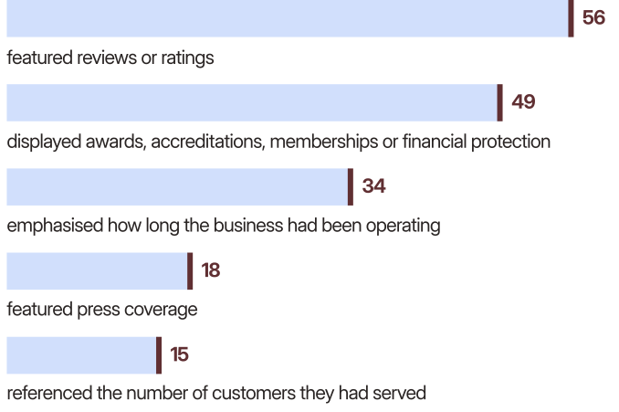
All useful signals. If someone is about to spend thousands of pounds on a trip, they want to know the company is legitimate, experienced and capable of delivering it.
But there is a limit to what those signals can do.
A 4.9-star rating tells me other travellers were happy. An award tells me someone has recognised the business. Twenty years in travel tells me you have experience. ABTA or ATOL protection removes an obvious concern.
They all give me reasons to trust you.
They don’t necessarily give me a reason to prefer you over another operator with equally good reviews, similar credentials and twenty-five years in business.
That distinction came through clearly across the sample. Trust was generally well established. A distinctive case for choosing one credible operator over another was much harder to find.
Trust removes reasons to say no. Differentiation gives someone a reason to say yes.
A strong homepage needs both.
So far, we’ve looked at what travel homepagessay. But we also wanted to know what they ask the traveller to do next.
For 64 of the 105 homepages, 61% of the sample, the primary next step was predominantly transactional: search for a holiday, find a trip, enquire, book, request a quote, call or speak to a specialist.
Another 32 took a more exploratory route, encouraging travellers to browse destinations, itineraries or inspiration.
Only 9 gave meaningful prominence to alower-commitment action that could create value before someone was actively shopping for a trip.
There is nothing wrong with a booking-focused call to action. If someone arrives knowing they want a walking holiday in Italy next September, helping them find the right trip quickly is exactly what the website should do.
The interesting question is what happens before that.
Travellers don’t suddenly become relevant when they are ready to search, enquire or book. They may encounter an operator months earlier while researching a destination, exploring an interest, following a recommendation or simply thinking about a future trip.
Yet most of the homepages we analysed became most useful once the traveller had moved relatively close to the market.
That leaves a much less crowded question:
What can your homepage offer someone who likes what you do, but isn’t ready to book anything yet?
To answer that question, we applied a fairly strict test.
We weren’t looking for whether a homepage had a blog somewhere, or whether there was a newsletter signup tucked into the footer. We looked for something a traveller could genuinely get value from even if they had no intention of booking anything today.
Only 19 of the 105 homepages, 18% of thesample, offered something that met that test.
The strongest examples went beyond simply publishing more content. They gave travellers a useful reason to spend time with the brand: detailed destination knowledge, practical planning resources, genuinely useful guides, tools or other forms of expertise that had value in their own right.
That matters because the value works in both directions.
The traveller gets something useful before they are ready to buy. The operator gets an opportunity to demonstrate expertise, create familiarity and give that person a reason to remember or return to the brand later.
It also changes the role of the homepage.
Instead of only helping people who have already decided they want a trip, it can start doing useful work much earlier, while preferences are still being formed.
That doesn’t mean every operator needs to build a course, tool or elaborate content platform. But with only 19 of the 105 homepages doing this meaningfully, it is one of the clearest areas where there is still room to do something competitors aren’t.
And importantly, it gives the traveller something to remember beyond the destination itself.
The similarities weren’t limited to what operators said. They also showed up in how the homepages were built.
Across the 105 homepages
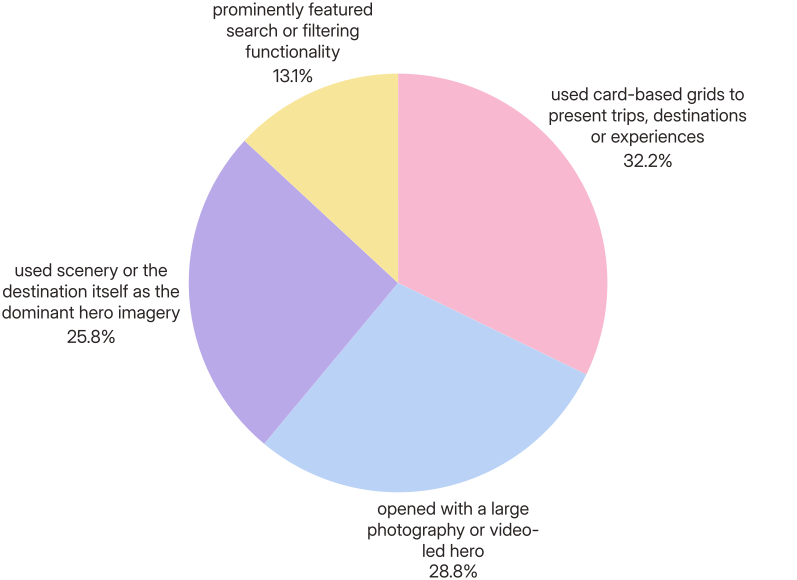
None of those choices is a problem in itself.
In fact, there are good reasons they are so common. Travellers need to browse options. Strong photography helps sell travel. Search and filters make large product ranges easier to navigate. Familiar structures can make a website easier to use.
The problem appears when the same structures are combined with the same kinds of imagery and the same differentiation language we saw earlier.
A full-screen destination image. A promise of tailor-made travel or expert knowledge. A row of featured trips. Reviews and awards. More destination cards. An invitation to start planning.
Change the logo, colours and photography and many of the homepages could still follow much the same journey.
That creates an interesting design challenge. How do you make a travel homepage feel unmistakably yours without making it harder for travellers to use?
The answer isn’t necessarily to throw out the conventions that work. It is to be much more deliberate about where you follow them, where you break them and how your brand, proposition, content, imagery and design come together to create something a traveller can actually distinguish from the alternatives.
Because if every operator has access to the same basic ingredients, the difference is in what you do with them.
Once we started looking at the overall journey rather than individual design elements, another pattern emerged.
Most of the 105 homepages could be grouped into one of five broad approaches:
None is automatically better than another. A large tour operator with hundreds of itineraries may genuinely need a Catalogue. A highly specialist operator may have much more to gain from behaving like an Expert.
What matters is whether the approach helps communicate why this particular business is worth choosing.
A Catalogue becomes a problem when the traveller remembers the trips but not who sells them. An Inspiration Board can make a destination irresistible without making the operator distinctive. An Expert only works if the expertise is actually visible and useful. A Brand World can look different without giving the traveller a substantive reason to choose.
The archetype itself isn’t the differentiator.
It is what the operator does with it.
Put all of those findings together and the blend-in starts to make more sense.
It isn’t caused by one bad design trend or one overused phrase. It happens through accumulation.
Many operators:
Each decision makes sense on its own.
A safari operator should show wildlife. A luxury hotel should have beautiful photography. Reviews build trust. Travellers need to browse trips. Clear calls to action help people take the next step.
The blend-in happens when everyone makes sensible versions of the same decisions.
That is why simply looking professional isn’t enough. Neither is having a beautiful website, strong reviews, decades of experience or a carefully written promise of personalised service. Plenty of competitors can credibly say the same.
The homepages that stood apart weren’t necessarily reinventing what a travel website should be.
They were simply giving travellers more that belonged specifically to them: a clearer point of view, more visible expertise, stronger evidence behind their claims, more distinctive ways of presenting what they do, and useful reasons to engage with the business beyond the immediate product.
And that gives us a much more useful question than “How do we make our homepage look different?”
What can we put on our homepage that another travel operator couldn’t simply swap its logo onto and claim as its own?
The good news is that standing out didn’t require operators to reinvent the travel homepage.
The strongest examples still used many of the same ingredients we saw elsewhere: destination photography, trip cards, reviews, enquiry buttons, inspiration and familiar navigation.
The difference was what they did with them.
Across the sample, five opportunities kept coming up.
The destination will always do a lot of the selling in travel. But if the homepage could belong just as easily to another operator selling the same place, too much of the differentiation is being left to the product.
The stronger homepages made the business itself part of the proposition. Their approach, specialism, people, point of view or way of travelling gave the traveller something to choose beyond the destination.
Expertise was the most common differentiator in our sample, but simply describing yourself as an expert does very little when dozens of competitors do the same.
The stronger examples made that expertise visible.
They showed who knew what, shared specific recommendations, explained how their knowledge shaped the trip and gave travellers access to insight they were unlikely to get from a generic search.
If you say your trips are tailor-made, show what tailoring actually looks like.
If you promise local knowledge, introduce the people or relationships behind it.
If personal service is important, show how that service works.
The more common the claim, the more importantthe evidence behind it becomes.
Only 19 of the 105 homepages offered something genuinely useful to someone without immediate booking intent.
That leaves a lot of open ground.
A planning resource, specialist guide, useful tool, original research or another genuinely valuable asset can give travellers a reason to interact with the brand earlier, while they are still learning, dreaming and forming preferences.
The important word is useful. Adding another generic blog or newsletter box isn’t the point.
Travel websites share conventions for good reasons. You don’t need to redesign familiar interactions simply to prove you are different.
But you also don’t need to follow the category everywhere.
Your art direction, typography, imagery, page composition, tone of voice, storytelling, interactions and the way you present your expertise are all opportunities to create something recognisably yours.
The aim isn’t novelty.
It is to make sure that when a traveller closes the tab, they remember more than the place they were looking at.
You don’t need to analyse another 105 websites to work out whether your own homepage is blending in.
Open it alongside three or four operators competing for the same traveller and ask:
You don’t need every answer to be perfect.
But if those questions are difficult to answer, that is probably where the opportunity lies.
There is one final point worth making.
A homepage can communicate your expertise, butit can’t create that expertise for you.
It can showcase a distinctive point of view, but only if the business has developed one.
It can give travellers useful reasons to engage before they are ready to book, but only if you have created something worth engaging with.
And it can make your brand feel different, but design has much more to work with when that difference exists beyond the design itself.
That is why the Great Travel Blend-In isn’t purely a website problem.
If every operator starts with the same destinations, similar products, similar claims and similar marketing material, the homepage is being asked to create differentiation from very little raw material.
The work therefore starts earlier.
Build expertise travellers can use. Develop are cognisable point of view. Create knowledge, stories, tools and experiences that belong to the business. Find better ways to demonstrate the things you already do differently. Give people reasons to know and remember you before they have a trip to buy.
Then let the homepage bring those things together.
That is also where First Mile Thinking comes in.
Instead of concentrating all of your marketing around the point where someone is ready to enquire or book, think about what your brand can do earlier to build familiarity, preference and demand.
We hope this guide has given you a few new ways to think about what that could look like for your business, and perhaps anidea or two worth exploring.
And if you have any questions or want to explore how we can help you put some of these ideas into practice, feel free to get in touch.